Arqu
The Challenge
ARQU set out to modernize the archaic workflows used by insurance brokers and carriers. The goal: design a comprehensive platform that would replace scattered tools, streamline communication, and reduce manual work.
But the user landscape was complex. We had to create an intuitive experience for brokers, often overwhelmed by email, outdated tools, and manual processes. while aligning with the realities of the carrier side.
How might we build a digital product that feels effortless for time-strapped users but powerful enough to manage high-stakes industry workflows?
My Role
As a product designer, I worked closely with stakeholders and strategists to bring clarity to this highly fragmented experience. My contributions included:
- Leading qualitative research and stakeholder workshops
- Defining proto-personas and mapping core pain points
- Translating key insights into actionable UX opportunities
- Shaping the information architecture and UX direction
- Delivering wireframes, user flows, and strategic recommendations
The Research
Our research surfaced the gap between current workflows and what users needed to work efficiently and collaboratively.
Methods Used
- Stakeholder interviews and cross-team alignment sessions
- Research synthesis into findings, frustrations, and JTBD
- Feature workshops based on a desired future state framework
- Audit of current tools and workflows to benchmark pain points
User persona: Adam, the Overwhelmed Broker
“I’m constantly buried in email and manual updates—I need a tool that helps me work smarter, not harder.”
- Digital habits: Always connected, overwhelmed by information
- Motivations: Spend less time on tedious tasks, become more efficient
- Frustrations: Outlook dependency, poor tracking, no transparency

Key Research Insights
Our user and stakeholder research revealed:
- Too many disconnected tools made tracking tasks chaotic
- Manual data entry consumed valuable time
- Information sharing was broken, especially across silos
- Follow-ups and status tracking were the biggest time drains
- Lack of transparency created frustration for brokers and clients
“Everyone is overworked because they are all doing manual data entry.” – Justin
Jobs to Be Done
To align product priorities with real user needs, we translated our research findings into clear, outcome-driven Jobs to Be Done. These were divided into two tiers: Essentials, which addressed the core functional pain points, and Delighters, which represented opportunities to go beyond expectations and create standout moments in the user experience.

To support these goals, we also designed a robust information architecture—a crucial step given the complexity of the workflows and the fragmented tools users relied on. The IA became the backbone for organizing features, simplifying navigation, and ensuring that every interaction mapped back to a real user need.
Design Recommendations
Based on research, we proposed UX principles to shape ARQU’s future state:
- Introduce hierarchy to help users navigate quickly
- Reduce cognitive overload through simpler layouts and familiar patterns
- Guide users in the flow using consistent CTAs and feedback
- Follow standards to reduce learning curves
These insights were handed off as part of a roadmap to move from audit to MVP definition.
Programs & Scenarios: Designing for Flexibility in Complex Workflows
We designed the Programs Manager as a robust yet intuitive tool that enables brokers to build complex insurance structure, like towers, layers, and segments. Within a single, clear interface. With side-by-side views and inline editing, users can add towers, modify limits, and manage specifications with precision, all while maintaining full visibility into the overall program structure.

To support strategic decision-making, we also introduced a Scenarios feature, allowing users to easily create and compare multiple versions of a program. Brokers can test variations in participation, premium, or carrier involvement, duplicating structures or entire programs in just a few clicks. This empowers them to assess trade-offs and lock in the most effective option.
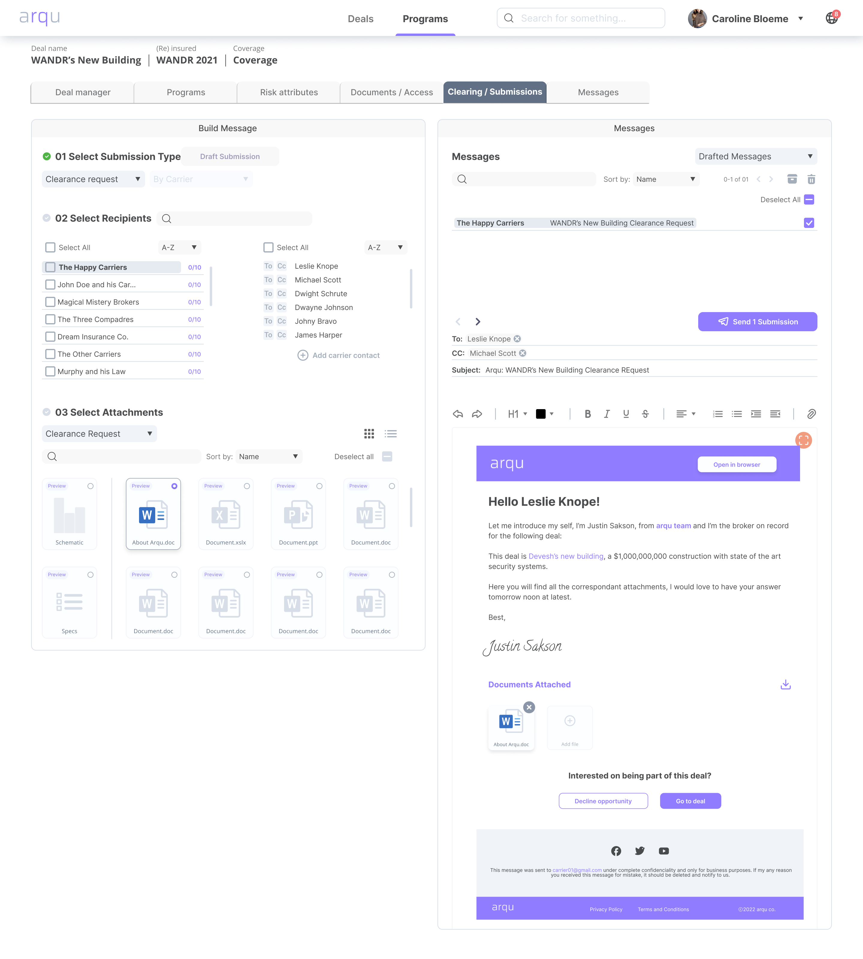
Clearing & Submissions: Streamlining Broker-to-Carrier Communication
One of the most time-consuming parts of the insurance workflow is preparing and sending submission packages to carriers. We designed the Clearing & Submissions module to make this process faster, smarter, and more human.
Our design allows brokers to:
- Build submissions in three intuitive steps: select type, recipients, and attachments
- Customize and preview emails before sending, with editable messaging blocks
- Send personalized, branded messages at scale, while maintaining clarity and professionalism
- Easily track multiple drafted messages across carriers in a single interface
The result is a seamless, communication-first workflow that reduces manual overhead and improves transparency.
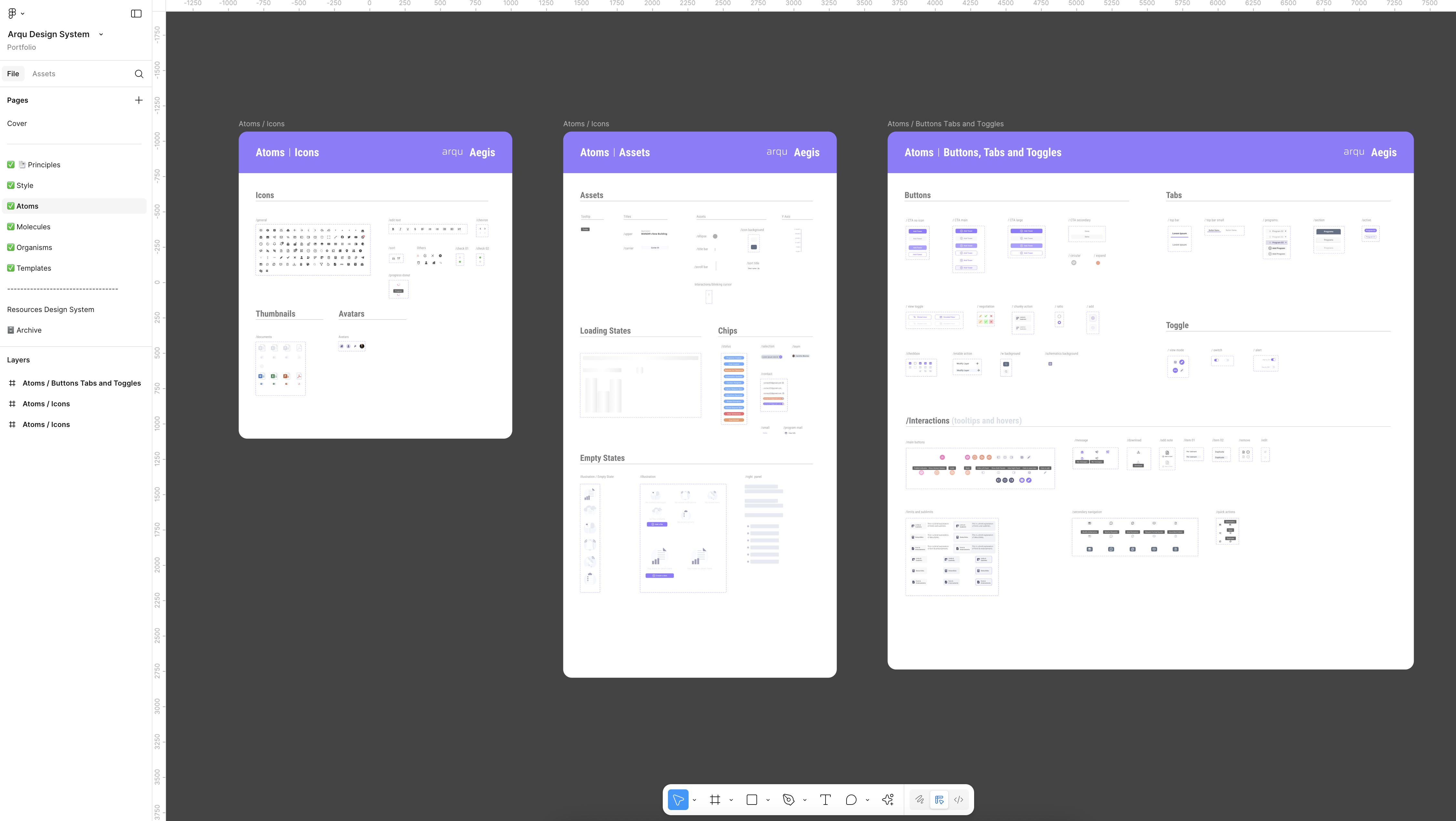
Design System
To support a complex product with multiple workflows, we developed a flexible design system tailored to ARQU’s evolving needs. It brought consistency across screens, accelerated the design-to-dev handoff, and ensured every component—from buttons to data cards—could scale across desktop and future platforms.
The system was foundational not just for visual alignment, but for enabling faster iteration and confident growth.
Outcome
Our work gave ARQU clarity on what mattered most to their users, and how to prioritize features accordingly. The insights laid the foundation for a product that could:
- Save brokers time
- Reduce system-wide inefficiencies
- Provide a clearer, more transparent experience across all parties
ARQU now had a north star for building a product that was comprehensive, collaborative, and intuitive, with user goals at the center of every decision.
In collaboration with:
- D. Uba